Digital Menu Boards
Panera's digital menu board renovation and expansion initiative launched in summer 2021 with the goal improving in-cafe guest experience and increasing menu trial, leveraging the digital format to do so with dynamic storytelling and personalization. I've led the creative strategy and design execution on the project from start to present, continually refining to reflect seasonal updates, evolving development capabilities and a brand redesign.
Client
Panera Bread
Year
2021-2022
Range of work
Menu design
Content strategy
Art direction
Collaborators
Gentl & Hyers / photo & video
Jones Knowles Ritchie / brand redesign
Mairead McGonagle / copywriting
Playground / photo & video direction
Steve Sangapore / motion editing
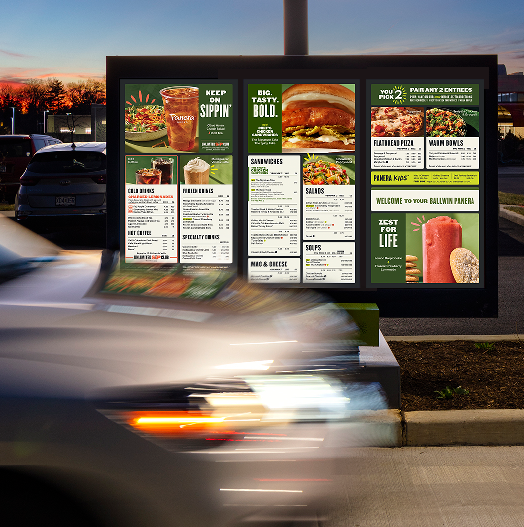
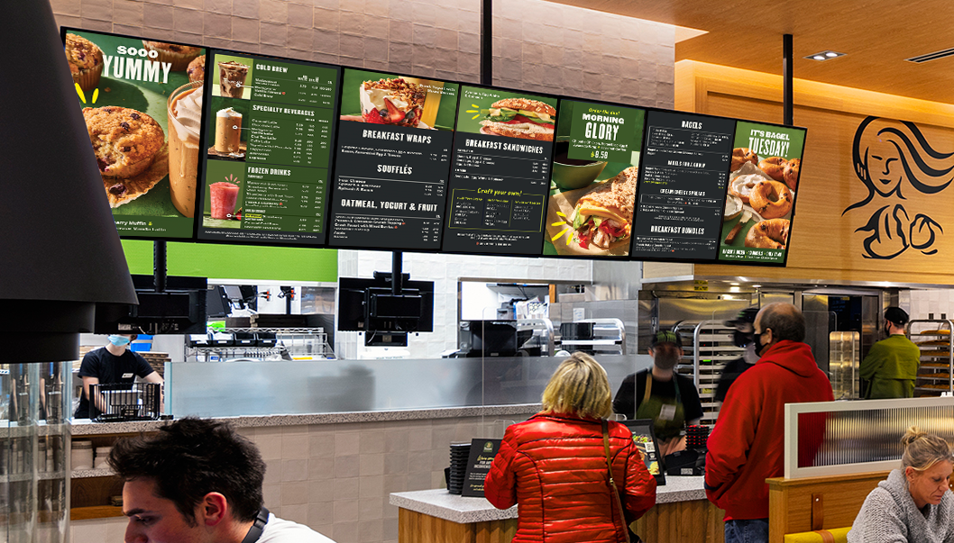
Overall design approach. The menu content display is strategized by daypart, and messaging and visual hierarchy is carefully considered for optimal scan-ability and hero-ing of key seasonal menu features. Photo and video is art directed to highlight the freshness and vibrancy of our food and ingredients. Brand design devices like variable size typography, handwriting and burst are used to invite the guest into the content.
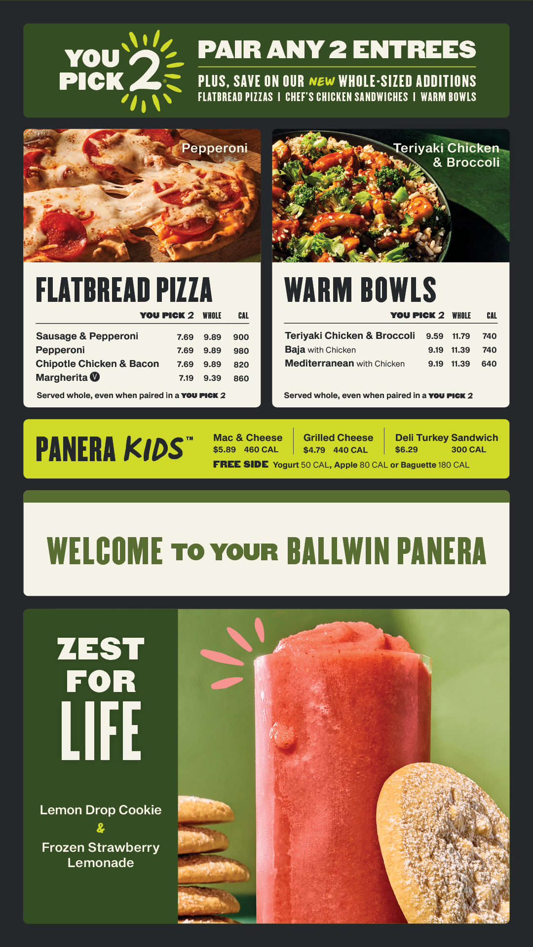
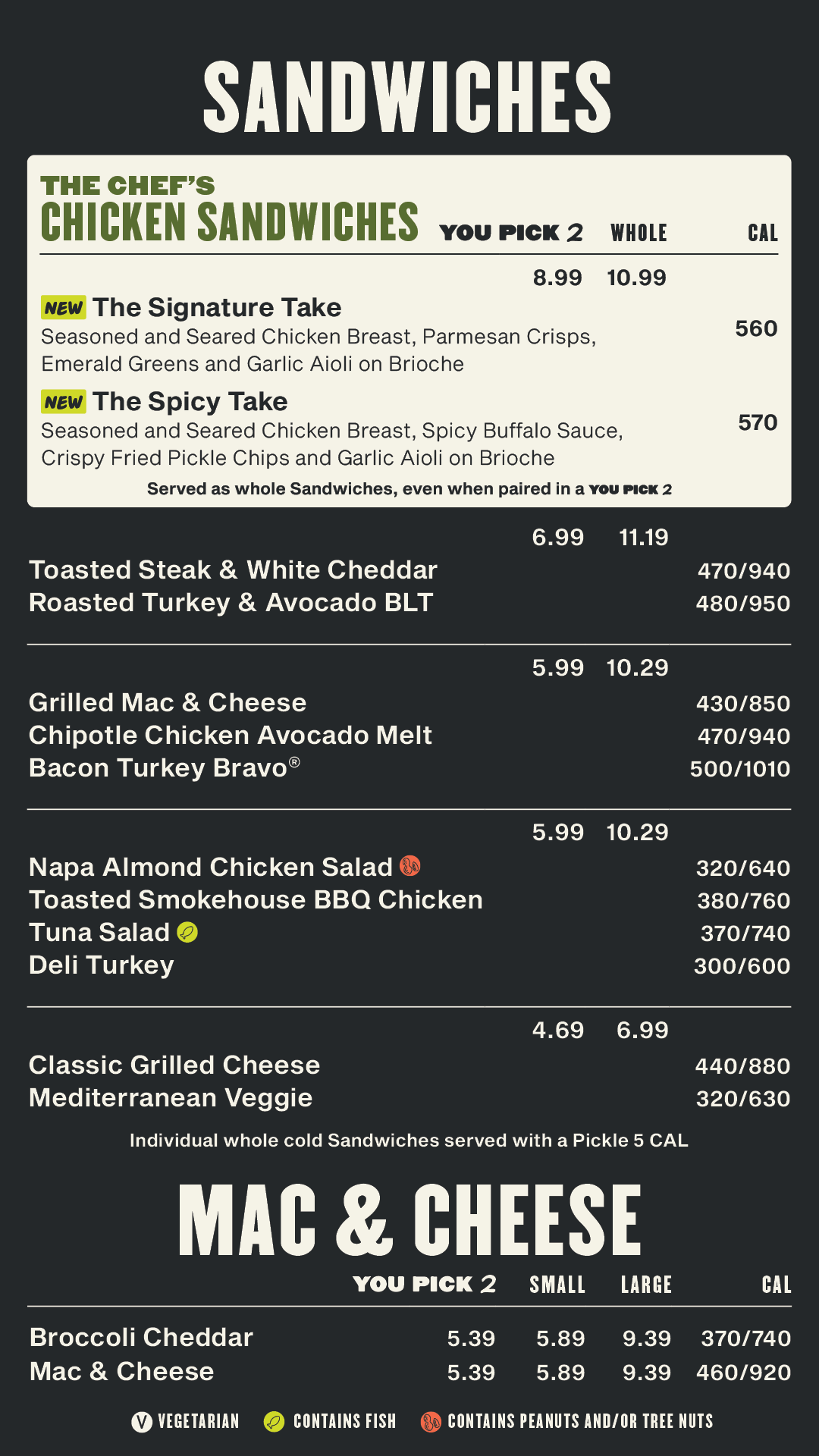
Drive-thru boards. The drive-thru features a preview board (pictured on left) and three menu boards further down the drive-thru lane (pictured next). Drinks are positioned first on the left menu panel as we know some guests are zipping through the drive-thru just for a liquid pick-me-up. The center panel has the most frequently ordered menu items, as well as enticing motion that draws the guest in and amplifies item crave-ability. The right panel has the remaining items as well as a "welcome" area — this is location-specific and also has the capability to feature a guest’s name if recognized as a MyPanera member. This area expands into the order confirmation screen as the guest begins ordering, and triggered upsells appear here in response to the guest’s ordering behavior.
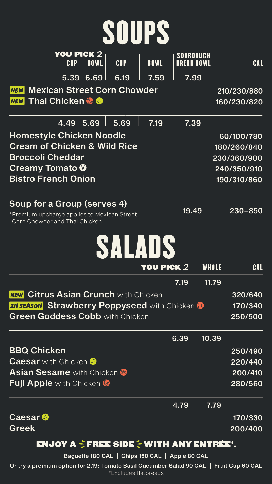
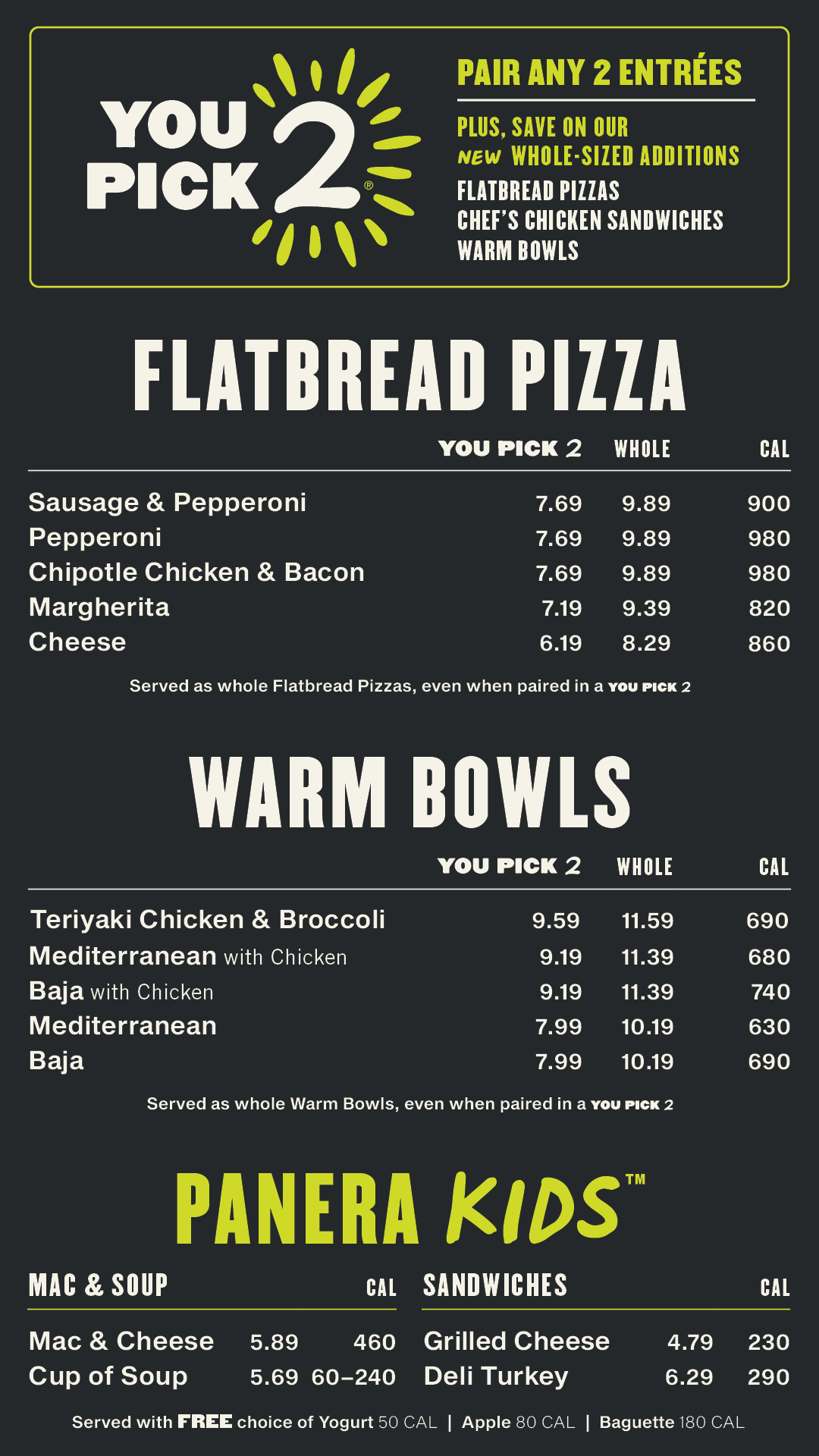
Interior boards. As we have cafe layouts with six, seven and eight interior boards, all essential content is designed to fit on six boards with two additional full feature panels that can be added as applicable. The drinks content rotates within a single panel to optimize space. Content with movement across the panels is synced so it feels dynamic but not overwhelming.
Let's get to know each other.
Send your hellos, questions and comments to hello@rachnathedesigner.com.
