
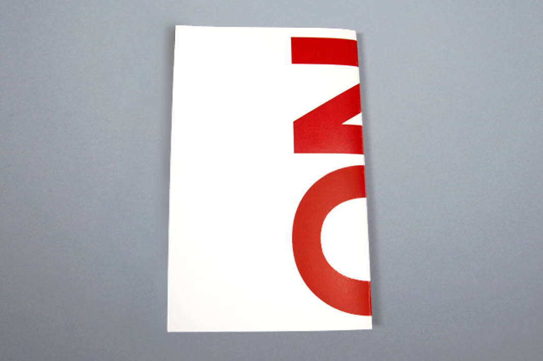
NO
NO is a catalog of "no" signs found in my neighborhood in Brooklyn. Repurposing a collection of found language into a catalog invites consideration and interpretation of what it means to be surrounded by this type of language every day.
2014 American Graphic Design Awards Winner
Year
2014
Range of work
Book concept & design
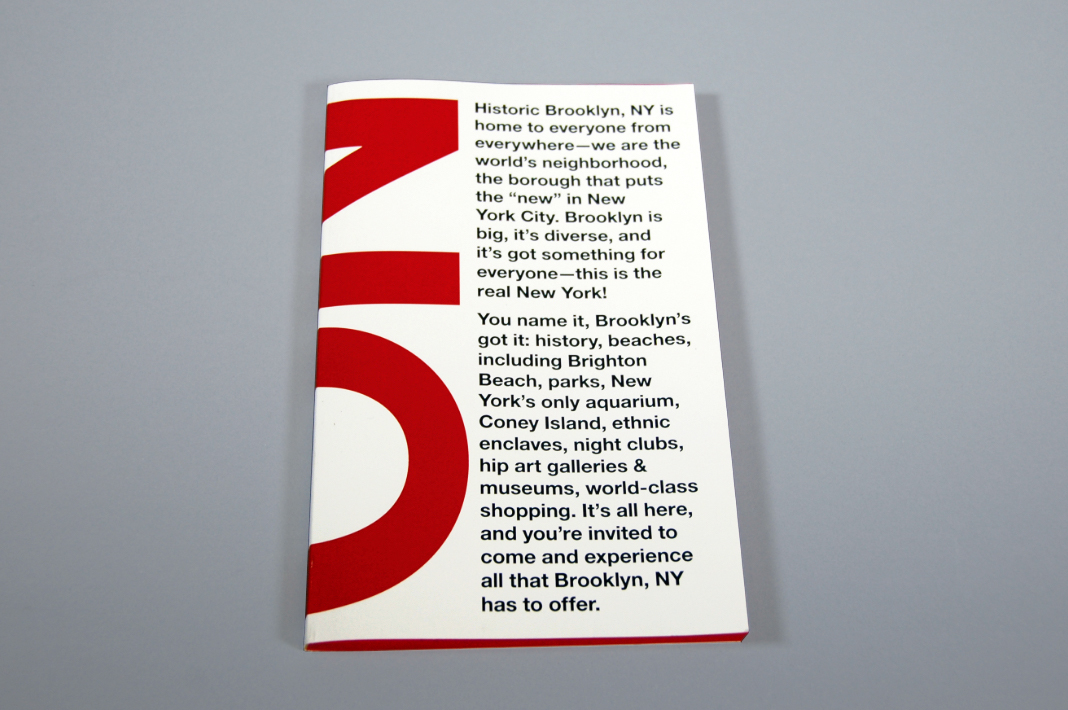
Juxtaposition. The text on the cover, appropriated from the Brooklyn Tourism and Visitors Center website, is introduced with a large NO that wraps around the front and back to intrigue and provide context.
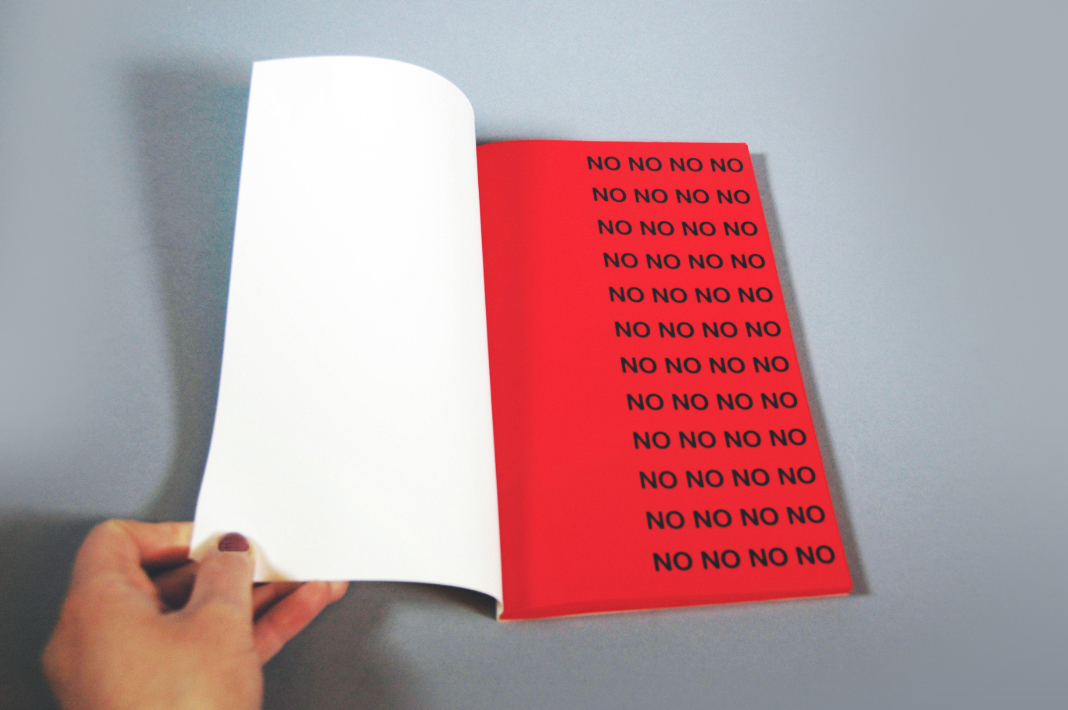
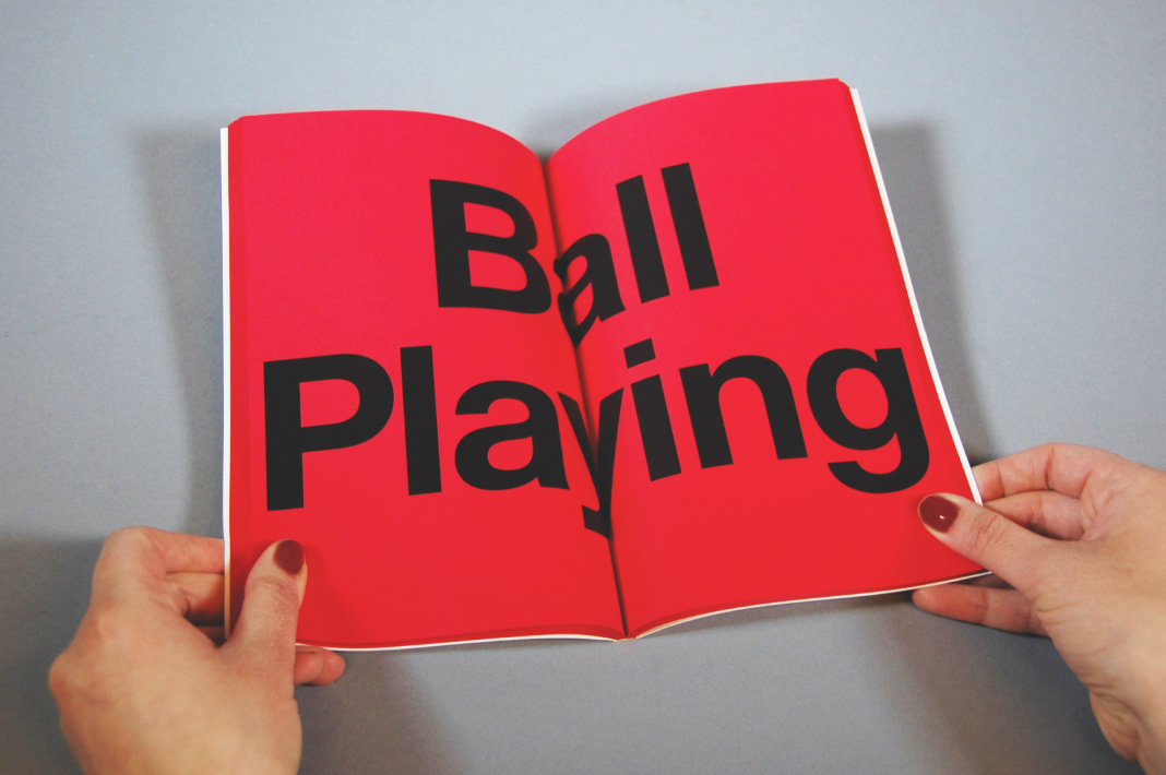
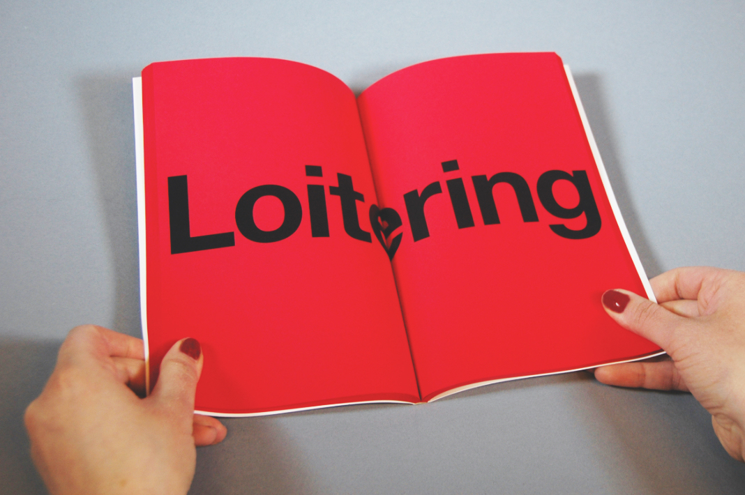
Form. The design of the catalog, and the order in which I arranged the signs, at first conveys a sense of authority but eventually becomes absurd and humorous. Meaning is created in my narrative with the use of repetition and isolation. The varying sizes of the text on each spread (typeset such that they are as large as possible on the spread, but varying because of the length of the words) give the reading of the book a sense of movement; this is meant to replicate the feeling of coming across the signs as you travel the streets of Brooklyn.
Let's get to know each other.
Send your hellos, questions and comments to hello@rachnathedesigner.com.