Silk Therapeutics
Silk Therapeutics is reinventing skincare from the ground up with its clean, age-defying Activated Silk™ technology. The problem? While Silk Therapeutics offered a compelling solution, a lack of clearly defined branding left it lost in a saturated beauty marketplace. I was tasked with evolving the existing brand look and feel to deliver on its brand promise of “real results and real clean” while retaining the existing logo and packaging.
Client
Silk Therapeutics
Year
2018–2019
Range of work
Branding
Art direction
Email design
Collaborators
Chris Pape / creative direction
Emily Belz / photography
Erika LaPresto / photography
Gabrielle Griot / copywriting
Jennifer Lange / brand strategy
Monica Mariano / styling
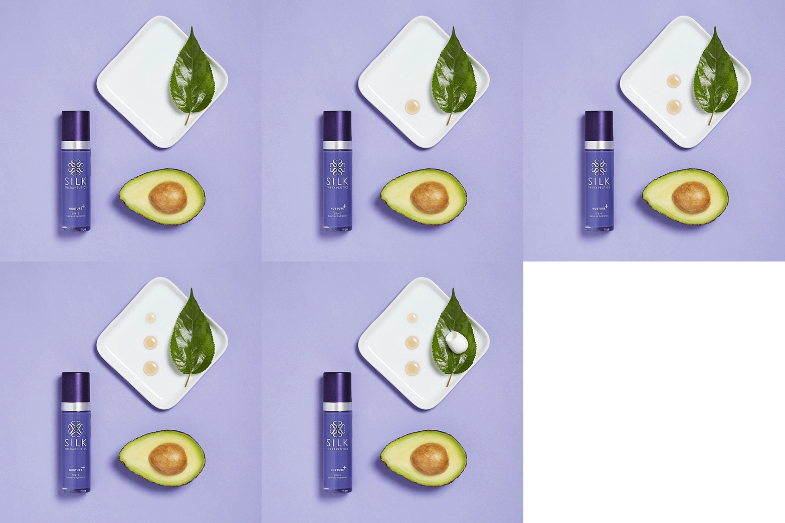
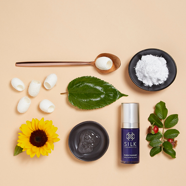
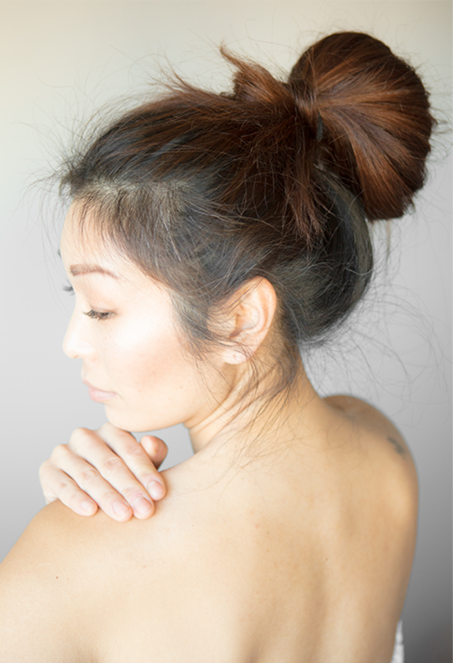
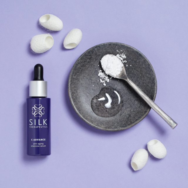
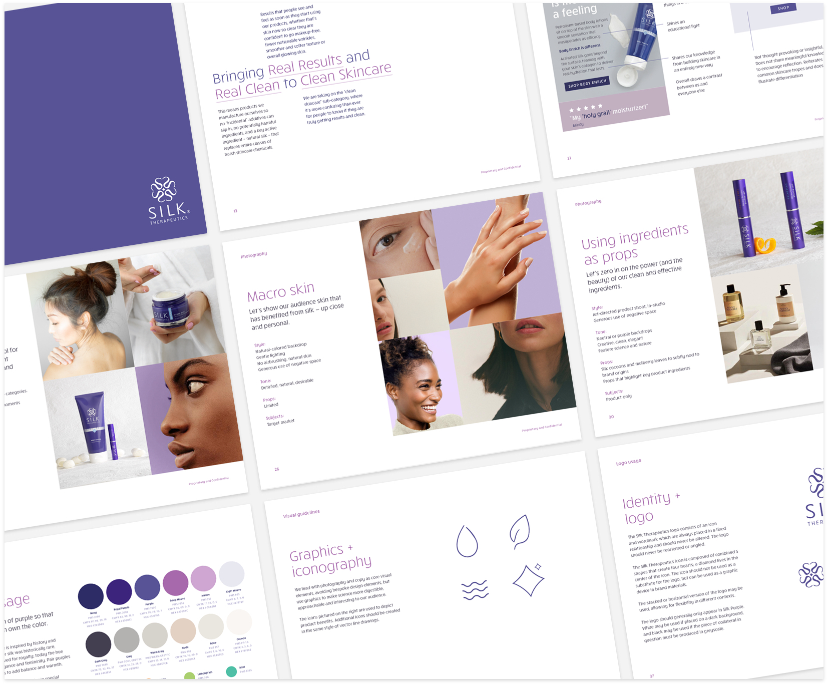
Photography. I planned and art-directed brand photography, shifting focus from clinical and generic to natural, potent and aspirational. Products were shot either within the context of use, or purposefully and artfully with actual ingredients as props — just as the brand’s skincare products are carefully formulated only using ingredients that benefit the skin. Models were shot with natural poses, showcasing close-up skin that has benefited from Activated Silk.
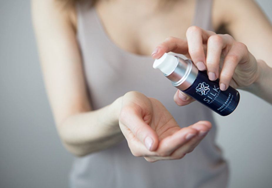
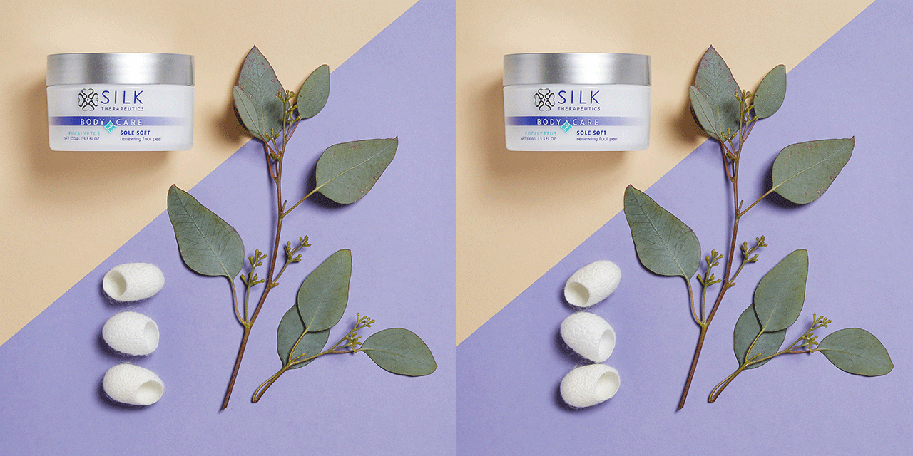
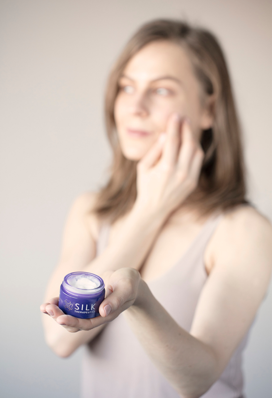
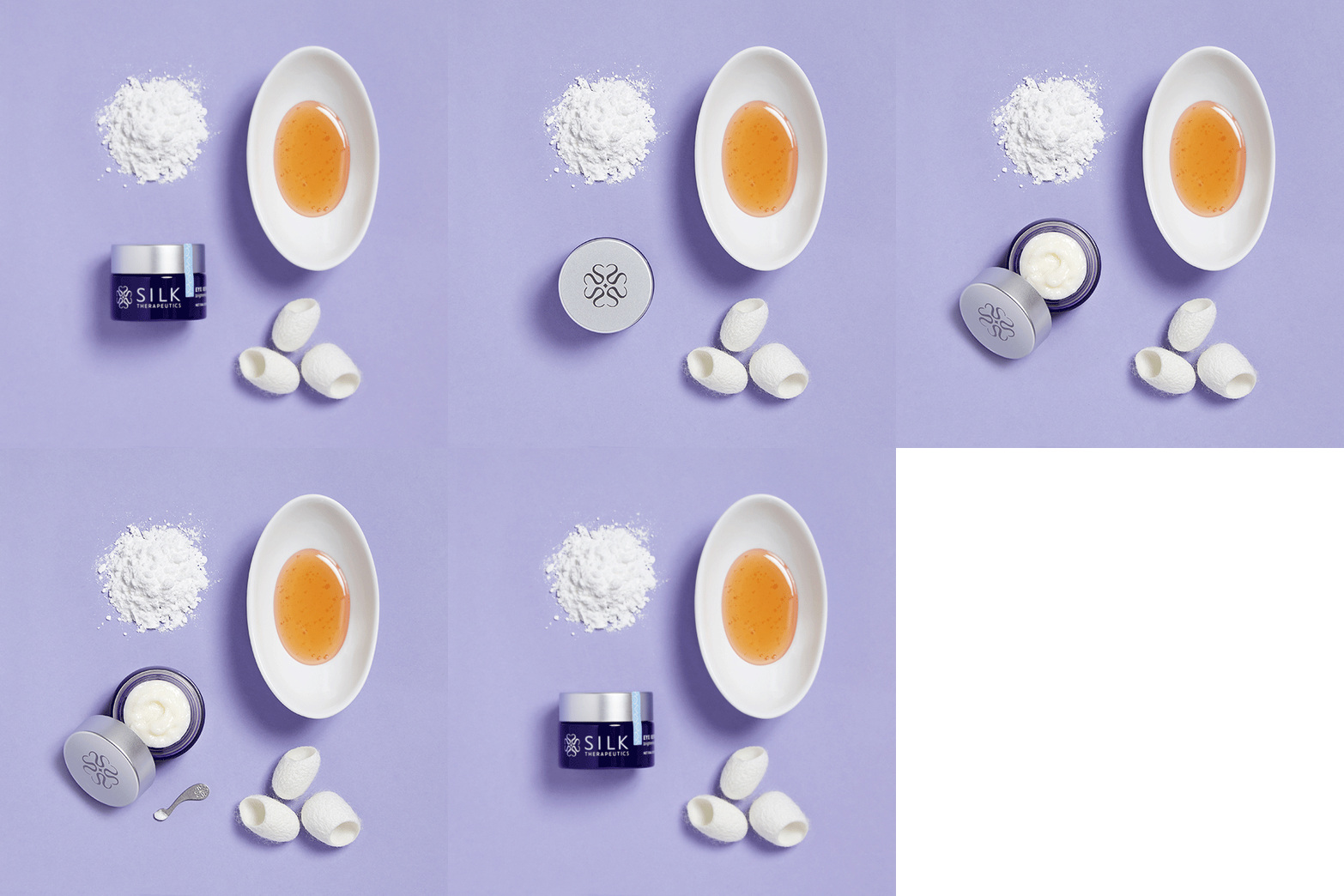
Communication Design. I simplified the typography to bring more consistency and sophistication to materials, and the expanded color palette added warmth and balance to the existing dark purple color scheme. Communication materials channeled the new brand voice of the thought-provoking guide, with design offering informative, meaningful and clean graphics to strengthen the messaging whenever possible.
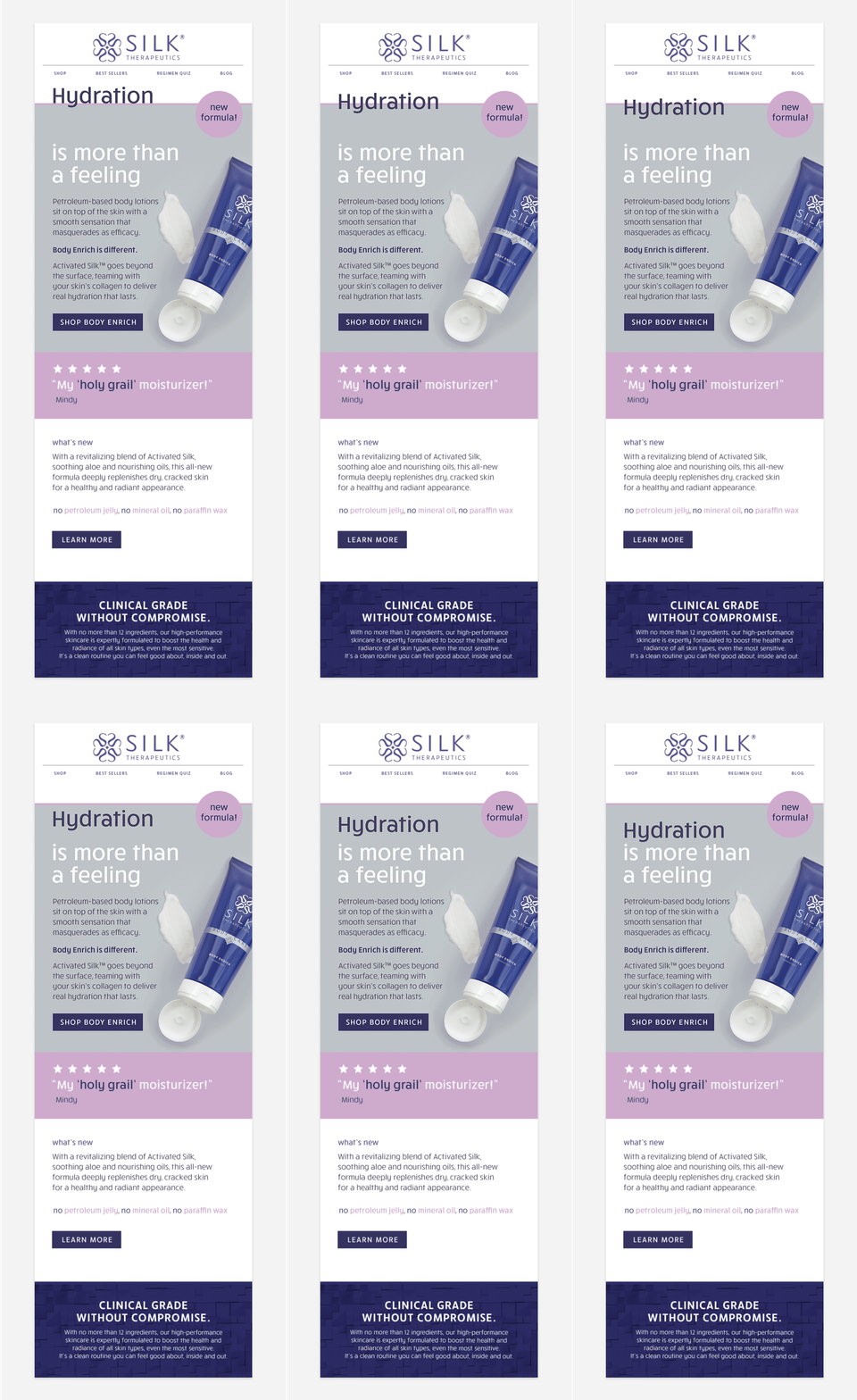
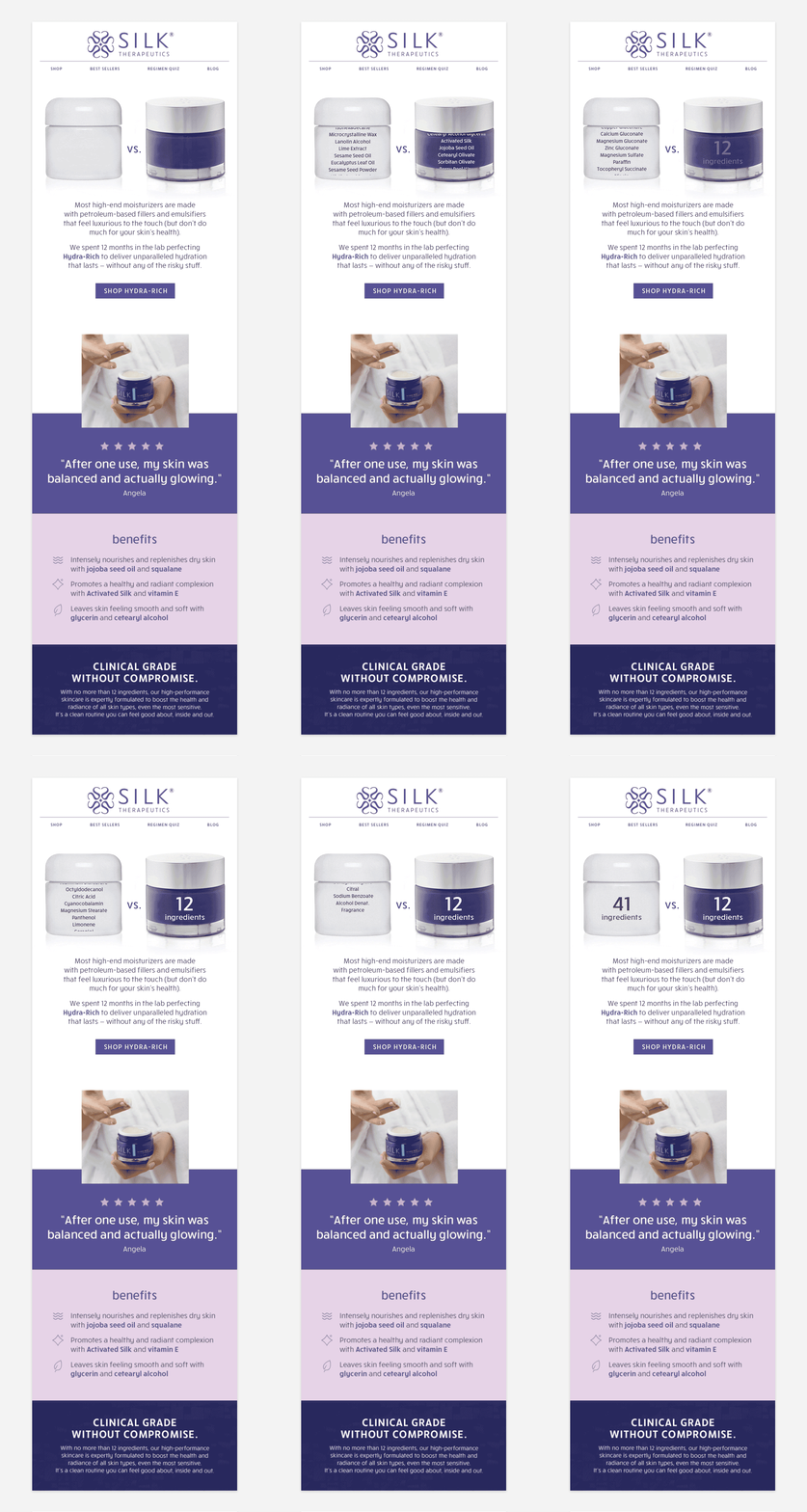
Results. The brand refresh was received well internally and externally, with redesigned email communications contributing to a 69% increase in sales within the first year.
Let's get to know each other.
Send your hellos, questions and comments to hello@rachnathedesigner.com.
